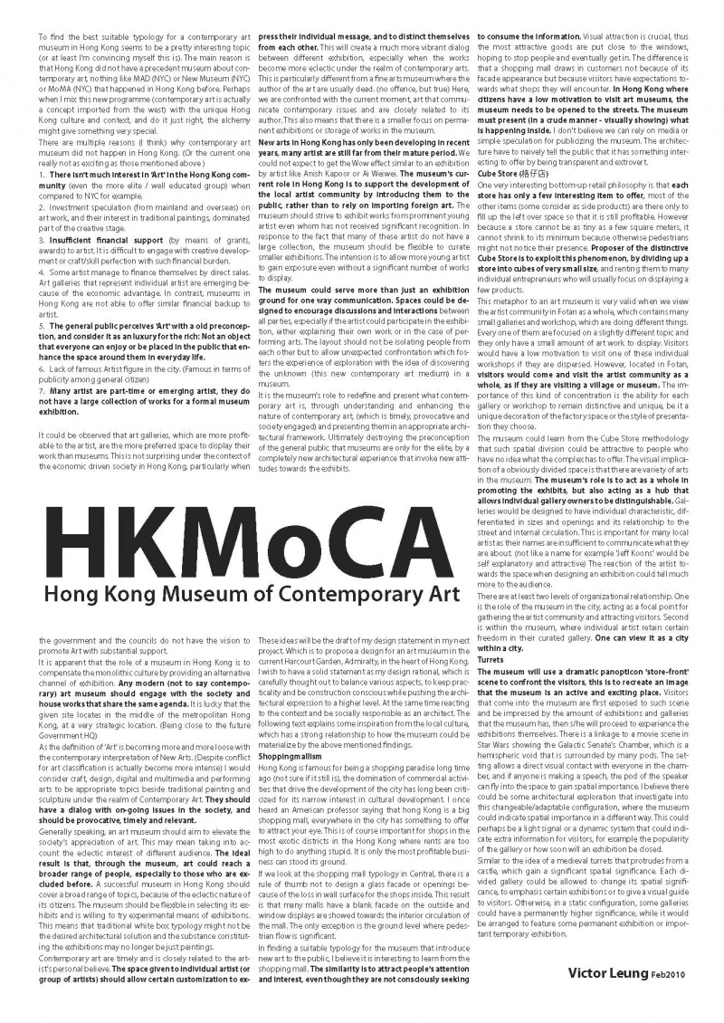
I think I can regard this as one of my achievement, is to have a panel pin-up review with only text on the wall. The reason why this is remarkable is the fact that many students in our school have a tendency to produce a panel packed with everything. It is very uncritical to include all things you can relate and put them on the wall, without thinking how useful the elements are in telling the story.
It is also a major disappointment when facing critics who solely rely on the images posted on the wall and neglect the verbal presentation. It is difficult to imagine an experienced critic without the tempt reach a quick conclusion based on the most obvious elements on the wall. It is a common phenomenon that critics consider the time during a verbal presentation the best time to reply text messages or ‘think about something else’. This is okay because it is always safe and easy, for any critic to pickup a topic when they are asked to talk, by quickly looking at the diagrams and images. Of course! Any trained architect could say something about an image.
I have no comment on how the critics behave, but my ideal practice is to organize my presentation such that everyone can follow easily. I admit I’m rude, but I wanted to design my presentation such that critics must listen to my speech in order to know what my story. That is why I must refrain myself from using images, at least not at the beginning.
I know some people would put up site analysis,  museum analysis, flow diagram, volumetric requirements even information about Hong Kong as a context filled with research data. The idea is only to show people that they have done something, which does not mean to be useful in helping to shape the presentation or help the design process.
I expected no critic would or could read my text on the wall. But only the title HKMoCA. This is enough for them to know what I’m doing. They are given a A3 sheet of this passage for their reference while I speak. The review this time is to talk about design philosophy and personal vision. It is only at the end of my presentation that I showed images by holding up a A3 size presentation board. This way of laying out my presentation is attempting to give my critics a fear at the beginning, if they don’t listen carefully about my speech, they would have nothing to say afterwards.

